Visualize This! Fixing a Telecom Global Services Business
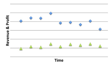
Recently I looked into telecom global service provider financial reports (Paywall: here), and as I lean toward the visual for insight and understanding, I prefer to graph the revenue and profit . Here is what I find in its quarterly reports:

Revenue and profits plotted over time suggests a slow descent into lower circles of suffering, and some analysts might suggest, “Abandon hope, all ye who enter here.”
That is a superficial view of the data and does not dig deeper to see what is happening. I get a different picture just by rearranging the data, and upon a closer inspection, and here is what I see:

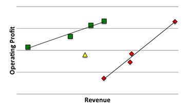
It is the same data, but grouped differently and presented for visually rich insight. Notice that I remove time from the horizontal axis and instead color-coded to help visualize before and after the change. Red is the Old Way, Yellow is Transition, and Green is the New Way. Profit is plotted against revenue.
The effect of change to the business put in place by the management is visually apparent. First, is the shift to the left, which is the result of rationalizing their contract portfolio. Second, the slope of the line has changed, suggesting more resilient and efficient business processes.
This global services business unit is on a path of recovery.